

University of Doha For Science & Technology
The University of Doha for Science and Technology (UDST) is one of Qatar’s leading public universities. Their existing website had grown large and difficult to manage, especially for students trying to find programs, application steps, or support services. Internally, content was fragmented across departments, and navigation felt inconsistent. Our goal was to rebuild the website from the ground up, with a focus on structure, usability, and accessibility—making it easier for prospective students, parents, and staff to find what they need.
Redesigning a national university’s digital presence—guided by deep research and designed for clarity, accessibility, and scale.
UX Research
User Journeys & Empathy Mapping
Accessibility
UI Design

Discovery & Research
This project began with a full discovery process to deeply understand the needs of users and the organization. We conducted stakeholder interviews, student surveys, and in-depth workshops with departments across the university. From this, we created user journeys and personas that represented key audience segments—from high school students exploring their first options, to returning students and administrative staff. We also ran an accessibility audit and content inventory to identify major friction points. These insights formed the foundation for every design decision moving forward.

UX Strategy

What we learned during discovery directly shaped the new site’s structure and flow. We rebuilt the information architecture from the ground up—making it easier to explore programs, understand admissions, and access support services. To validate our approach, I created wireframes for over 90 pages, applying the insights from our research. These wireframes were shared and tested with users in early-stage usability tests, which helped us refine layout, content hierarchy, and interaction points before moving into visual design.
Using the user journeys and user personas, I was able to use this foundation to build the information architecture of a website this large, ensuring content reusability, ease of search, and accurately drawn out design blocks.
This process ensured we weren’t just designing something beautiful—we were designing something that worked.
In addition to that, I also took an iterative approach to our research, testing our user journeys and accessibility guidelines as we were designing the user interface.


Visual Design
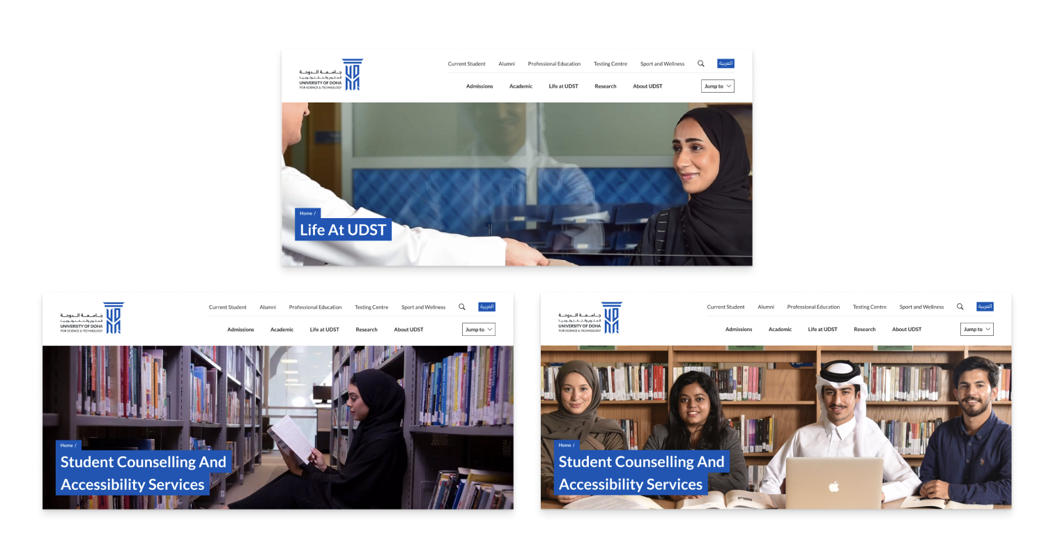
Once the structure was in place, we moved into visual design. The direction needed to feel modern and credible while still approachable to a wide range of users. I used a modular layout system with strong typographic hierarchy and clean spacing to keep content readable. This included the incorporation of a mega menu to showcase the full sitemap. The design reflects UDST’s institutional brand, but applies it in a way that feels fresh, student-focused, and mobile responsive. Accessibility remained a priority throughout—from color contrast and font choices to clear buttons and link styles.


The Outcome
The redesign successfully brought clarity, structure, and modern design to Bayer Becker’s digital presence. It made it easier for users to understand what the firm offers and why they’re different. The site now supports better search visibility, stronger storytelling, and a smoother user journey. The client was especially happy with how the new design elevated their portfolio and presented their services in a more strategic, professional way.